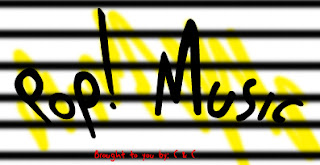
Pop! Music eins, seen below is black, white, yellow and red. If ye like it, just comment and leave behind: Eins.

Pop! Music zwei, also below consists of purple, black, some red, and the flash that incorporated white into it. Again, if you are particularly fond of this one, just comment and leave: Zwei.

Pop! Music drei, below, has been inspired by The White Stripes due to the colors red, white and black. Comment, and the keyword you will have to type down is: Drei.

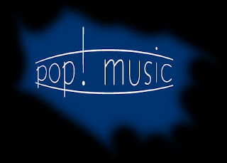
Pop! Music vier is the last of the ones; created of blue, black and white. This came to be by accident, the final one, if it fancies your taste of logos, VIER is the word to type.

Thank you for your participation. As a result of your comments, if you leave behind your name and age, we will enter you in a raffle where prizes ranging from an interview to a ride to the moon will be given away almost instantaneously to the participants with the most awesomest of names. Again, I thank you, and I hope that my fellow comrade in treason to pop music will also vote. I will not vote, considering that I already have a favorite, even if all of them are simple and not very ridiculously good looking. Ha.
- C.S.H.

2 comments:
I like the black yellow and white one...its bad ass.
The last 3 look pretty good...
The second one is the most modern, the third looks retro, and the last one gives me a House-of-Blues-ish feel. If I were to choose, it would be the second one. However, it just depends on whatever you guys envision this Pop! Music thing to be...
Post a Comment